How Can Web Design Help Your Small Business?
Effective design does more than looking good. When making decisions on who to use to fix my boiler or what company we should sell our home through its important to remember that we all use a frame of reference for these decisions. It can come down to a combination of previous experience and comparison. That’s why strong design can help guide your potential customers to make the right decision and chose you! My job is to hunt out these problems and render them obsolete!
A simple example of this is websites. Your clients boiler is on the blink and they are not the type to go to British Gas, they are local people, they want someone more trustworthy, more personable. So they fire up google and look for boiler engineers in the area. Now they have a range of tabs open this is where the design comes into play. Decisions are made quickly. Certifications are a must, but all of these have that, so what sets them apart? Usability and effective design. You would be surprised at how many websites don’t function as they should and while they may seem clear back when you built it, the potential customer doesn’t feel the same. Then you add in some gnarly colours or a logo that looks like its from Victorian times, the sale has been lost.
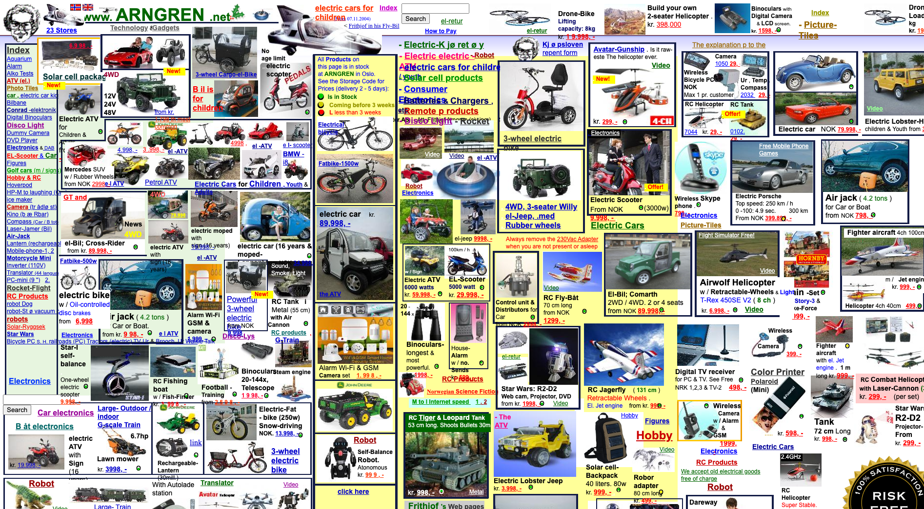
A perfect example of bad web design. Where on earth do you even start?
Studies show that when visiting websites 75% of how credible you look is based on your web design. Thats no small number. In reality, that translates into money lost, plain and simple..
Web design (and branding for that matter) is made up of a few things that, as designers, it’s vital to get right. These include:
Colour - Think BP. Not always the most popular, but greens give a feeling of peace, growth and health.
Texture - Metal evokes an industrial feel, while something like wool will give a warm, cosy feel.
Shape - Rounded edges are friendlier than harsh sharp edges. Compare Lego to American Express.
Space - Think about how difficult it is to read things when they are all squashed together - not good.
Type - This is a big one. Compare the fonts used in The Financial Times compared to The Sun. Huge contrast.
Balance - Something that works on a more subconscious level for customers, but vitally important to readability.
All these things can contribute to your overall brand feel and generate confidence in your brand, before you have even exchanged words! Essentially, effective design gets you noticed.
So the question is: does your website entice your customers or are they put off before you’ve even spoken to them?
I would invite you to look at your website, look at your competitors and weigh up if it works on a basic level, and does it help or hinder your potential business.
Another vital aspect to your website is responsive web design. In essence, this means that opening up your site on a tablet or mobile won’t hinder the user experience. The page alters slightly to fit the screen without making it difficult to navigate.
Solutions
It all depends on your businesses needs and budget. Below are the three main options, that I would be happy to help with:
Use a DIY website builder like Squarespace or WIX. They have really handy templates that are pretty simple to use. It’s a click and drag kind of set up. Just note that its not a given that the template you chose is right for your business or that its set up in a way to make the user experience (or UI as its known in the trade) as seamless as possible. There are some limitations in terms of how custom you can make the site, but it’s relatively low cost.
Use a template or theme built website like Wordpress. This one is for the more tech savvy among us that are happy to have some learning involved before taking the plunge. It has a large open source community with plug ins that can be added, tailored to different sectors. Again, this one is quite low cost.
Have a custom website built. Make no mistake, this would be the most expensive of the three but ‘the possibilities are endless’ as they say. You would have someone that would manage the site, built to your exact needs. You would have to go through the developer to make any changes needed.
Some clients take the option of having someone, such as myself, build the website on the likes of Squarespace or Wordpress, with the view of handing it over once built. This option can sometimes be the best mix. It means you have a professional design the website to your needs, you don’t have the large cost of a full custom website build and you are able to make changes and upload photos, blog posts or anything else with little to no hassle.
If you would like to have a chat about your website and where I can help you out, get in touch here!


